Assignment: Choose an image relevant to your research project and give it relevant alt text. Then, write a paragraph reflecting on the WCAG Compliance checklist, go into detail about at least one item on the list.
My Image w/ Alt text: Proclamation by George Washington, 1791.
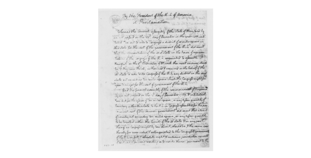
(Real ones will recognize this from my Tropy post 🫡)
WCAG Reflection:
So, when initially scanning through the WCAG list, I didn’t know what most of the items meant past the content section… I tried looking further into some of them, like “validate your HTML,” but I didn’t know what was going on at all (code is not my strong suit. It’s quite the opposite, actually). Anyways, because I didn’t understand anything that was going on I decided to focus on something I did understand, which was to use left-aligned or right-aligned text. This item has to do with the visual presentation of a website, since apparently center-aligned and justified text is harder to read than left/right-aligned text. I’m not sure why this is true, but I’m pretty sure the WCAG has more authority on the subject than I do, so I believe them! Using text alignment that is easy to read is important especially for websites that are word heavy (like blogs), because if you want your information to be shared with the most people possible, then you want the content, specifically the text, to be accessible. I’ve seen a lot of different text formats and alignments over many websites, but when I search my memory, I can’t recall any word-heavy websites (I’m thinking specifically of news websites) that don’t have right-aligned text. The Washington Post, for example, uses right-aligned text for their articles and their titles. But even non-word heavy websites, like Youtube, use right-aligned text for their titles, descriptions, and comments. It’s kind of cool I haven’t noticed small details like this before, but now that I know about it I’ll probably never be able to unsee it.
OK Bye 😀